f The Bugbytes: June 2013

Welcome - Copyright & Disclaimer

Welcome to The Bug Bytes a site/blog mainly for Papercrafting and some photography and other stuff thrown in here & there. Add in some die cutting machine, scrapbooking tools, cameras, scissors , glue and...... My name is Pam. If you have been redirected from Papillon Digital Design you have come to the right place.Hope you get inspired by the projects, videos and files. Would love it if you could leave comments and become a follower. (Word verification is turned ON to avoid spam. Sorry for that inconvenience.) Would love it if you would also share your project here . If you find a linky under the post do share your project by posting link there or if you do not find a linky post your link in the comments.Thank you for visiting. The website Papillon digital designs has changed to Papillon Digital Design so if the link gives and error or takes you to page with chinese characters then please drop the 's' in the link at the end of papillondigitaldesigns and try . That is change papillondigitaldesigns to papillondigitaldesign and try the link.

June 25, 2013

DS4J CHALLENGE # 70 – Paper Folding Embellishment

The challenge #70 this fortnight at DS4J is to use atleast one Paper Folding Embellishment  in your paper crafting project.
From this month onwards we are having it a bit different at DS4J
Each month one of the  DS4J DT member will be sponsoring the challenge.
This month's challenge is given to you by  Desire from Doing Life.
So here is my take on the challenge
I made a card using image Flamingo Pair


The image is colored with copics
The wave below is a memory box die 98438 which I got from Darlene at dutchpapercrafts
I did surf the web and looked at various techniques for paper folding techniques. Then I added subtracted  and why not - let's include multiplied and divide lol  and came up with this. The toughest was the origami flamingo. I almost crumpled it and threw it out . I gave it a day and then came back to it and rather liked how it turned out..
So let's see your creation with paper fold. Link it up at DS4J


post signature

Etching Glass

Hello Crafty friends, 
Sherri Here from Sherri's Crafty Place,
Thanks Pam, for letting me share my project today.
Today\s project is glass etching, I LOVE to etch glass!!!!!
It is so much fun, if you haven't tried it yet, you really must give it a try .....
So I have 2 drinking glasses to share with you today,
                                                   using some scrap white vinyl,
I decided what I was going to cut out, 
I was doing 2 glasses and she wanted them personalized
here are the glasses I was using 
 apply vinyl to glasses
  don't forget to weed the right parts, 
oopps this was take 2 on weeding, the Sam's mum part
yes I weeded the wrong parts...lol
and the here is the finished glasses, I am very happy with how they turned out...
I know my step-mother will love them

 Thanks  for stopping by today....
Happy Crafting

❀Sherri❀

June 24, 2013

A great news (for me ) which I want to share on my blog

 I have such a lovely bit of news to share.
As you know I get my die collections - the spellbinders from amazon but the other lovely dies like cheery lynn, marianne and joycrafts from a lovely sweet person called Darlene from http://dutchpapercrafts.blogspot.com/.
She makes such lovely video presentations of the products with the help of her awesome design team. SO inspiring and I have watched so many of them when I needed to see how the die was used.
While placing another order she asked me if I would like to be a member of her design team and of course I said YES.
I won't be designing right away as I need to recover from the surgery first but I CAN"T WAIT TO BEGIN :)


post signature

June 20, 2013

Kick Up Your Heels - CAS (with a little sass!)

Hi Everyone

Michelle here from Lady of Leisure with another Dare To Be Sassy Thursday challenge from Sassy Studios.  This week the theme is 'Clean and Simple'.  If I am honest, this without a doubt was the hardest challenge for me - crazy right?  I mean it's just clean and simple - it's not difficult is it?  Apparently for me the answer is "yes".

After much scratching of my head I finally had an idea, and then I asked my daughters for help with the colour scheme - needed the right 'pop' of colour.  So this is what I we came up with.


These 'legs' actually belong to Dorothy from April's Wizard of Oz release.  I printed the image and sentiment (font is called 'Fling') from my Silhouette Cameo, and coloured with ProMarkers.  The shoe colour my girls chose is called 'Lime Green'.

So that's it - not nearly as painful as I thought that it would be.  I think I may even make a few more of these to keep on hand for girly birthdays or special events.

I hope you will visit the other Sassy Studios Design Team members to see what they have created, and maybe you will be inspired to join in with the challenge and win some sassy images for yourself.

As always Pam thank you so much for having me visit.

Michelle

June 17, 2013

4th of July Card with Washi tape and Paper straws

It's almost that time of year again!!! 4th of July!!! I love this holiday, yes to celebrate our independence but also because of all the excitement that surrounds it. I love the fireworks, the colors, how people show their patriotism and the family gatherings. I think the 4th of July should be a week long celebration!!!

Hello everyone, it's Danita from danitasdesigns.blogspot.com. In this month's project I am using paper straws and Washi tape. These two things are new to me in my crafting experience and I wanted to see what I could do with them.

Here's the front of my card

Here's the inside


 I have a bad habit of not sketching out my cards.  That is probably why it takes me so dang long to finish one!!!  I just tend to go with what comes to mind. I decided that I wanted to change a cut file in the Silhouette store to a Print and Cut file. I chose this Eagle banner. I cut out the banner but then I had no idea where to go from there.


So played around with another cut for the back ground, but I couldn't get it to come together so I trashed it! 
 I didn't want to waste all those cute little stars so I used them to go on top of the straws.  I colored them with my Copic markers.  Then I cut 3 pieces of straws at 2.25 inches and adhered them to the back of the banner, with my glue gun.
 The straws will act as pop-up dots for your image.
Next I stamped fireworks onto to the front of the card and added my Washi tape at the top and bottom.
Then I placed the banner and straws on top of the card.  You can see how the straws lift the image off of the page for that dimensional look.

For the inside, I cut out the phrase "Happy 4th of July" with my Cameo. I stamped on a few stars and a flag.  I cut another straw at 4.25 inches, flattened it out with my brayer and used it as an accent on the bottom.
 
 Again, the Paper straws and Washi tape is new to me, but I am thoroughly enjoying incorporating them into my crafts.  I am finding that when a card seems to be just "missing something" a little Washi or a decorative Paper straw goes a long way!!
 
 
See ya' next month and have a Happy 4th of July!!!


June 14, 2013

A Simple Father's Day Card


Hi Everyone,

Lisa from Lisa's Craft Room here sharing a simple Father's Day card. It seems like this month is flying by. I can't believe Father's Day is Sunday already and my husband's birthday is Tuesday. Thanks Pam for having me again this month and I am so glad you are on the mend. I hope you get lots and lots of rest and are spoiled while you recover. :)

I used a blue card base from my stash and added a layer from DCWV's The Guy Stack. The mustache and glasses are from Emma's (My Creative Time) stamp set and dies called What's Growing On? The sentiment is also from Emma called More Gift Card Sentiments.

I stamped Happy Father's Day around the card with black Memento ink, adhered the glasses with a two way glue pen and added dimensionals to the mustache.

Thanks for stopping by. I always appreciate your visits.


June 11, 2013

DS4J challenge #69 - For the men in our lives

The challenge theme the next 2 weeks  at Digistamps4joy 


THEME : 'For the Men in our lives'. Basically to celebrate Father's Day, but your card/creation can be for a father, grandfather, stepfather, boyfriend, or a very special male friend. In other words, show off the specialty of being a man and celebrate him."
SO make a paper crafting project to fit the theme and post your linky. Check out the awesome inpisration from the rest of our DT members.
Here is mine - An easel card using this cute image Gramps


I distresses the edges.
The tree and house border is a memory box die 98239 - Country landscape


post signature

June 10, 2013

Hearts that Love are always in bloom


Hi
 I love challenges and Jo's Scrap Shack has fun challenges every friday.
This friday the challenge is photo inspiration - http://www.jwscrapshack.blogspot.com/2013/06/ffc3-photo-inspiration.html

The photo to inspire is this one


And my card is simple.

I chose the CAS style.


The doily is from one of Martha Stewart circle edge punch - diamond lace
The center flower are memory box peony die and outline.
The sentiment is anna griffin new sentiment stamp.

post signature

Easy Money Layout


Hello!  Lori here from ScrappinMyStressAway with a fun layout.

  Tanner finally lost his first tooth on December 30th.  He was 7 years old and one of the very last kids in his grade to lose a tooth!!

I saw the layout below on Pinterest a while ago and was finally able to scrap lift it!!

I really liked the title - substituting the tooth for the letter "o" - and wanted to copy that.


I used the font LD Mon Cherie from the Silhouette Store.  I left a space where the "o" would go.

I bought the tooth set also from the Silhouette Store and sized the tooth to fit the space of the "o".  I did cut the word Smile as well, but not the scary dental tools :)


Once I got the tooth the correct size, I moved it to another spot on the mat.


I cut out the letters in red cardstock.  I saved the negative piece so I could use it as a template.  I ran my letters through my Xyron.


I put my template at the top of my page and adhered the letters on.


I carefully lifted up the template and my title was perfect - just missing a tooth!!


I cut out the tooth and the word smile out of white cardstock.  It is hard to see here, but I inked the tooth with a little bit of blue before I pop-dotted it down.


I used some white DMC floss to make dental floss and glued it down.


I added a little stickle sparkle to the dot of the "i" and as I did I was thinking of the gum commercial "Dirty mouth, clean it up {ding}"


I wound some white DMC floss under my title so my title was not just floating on the top of the page.  It was a bonus that it resembled dental floss.

This layout was difficult for me because I usually draw the colors of the photo out onto my page.  I did not have much to work with here, but I think it turned out just fine.

I journaled across the top of the photos.

I am excited to share this layout with my friends at The Bug Bytes today!!


June 9, 2013

Stand Card, Photo Frame

Hi Crafting Friends :)
Today I get to share my project with you here and at my own blog Adele's Creations

I have been using my electronic cutting machines for many years now, I started with the Craft Robo, which Silhouette America bought a few years ago and renamed it Silhouette SD, after all these years of crafting and designing I have a ton of designs which I now use in my Cameo, I love to share my design's with you all but unfortunately very few leave comments on my blog, though hundreds take my free files, it is very sad :(


Although this is disheartening, I will continue to share my designs for free, even though I rarely get a thank you!!
Moan over.....now onto my design for this months design team......

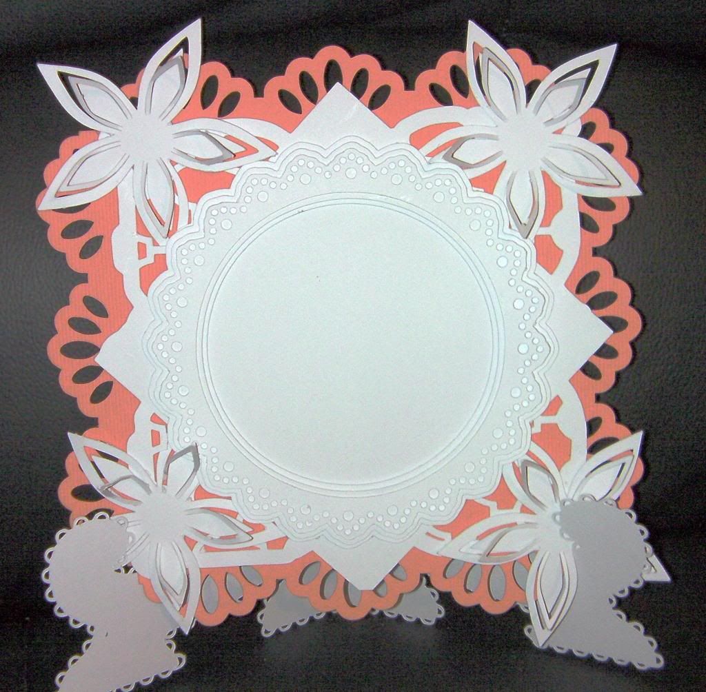
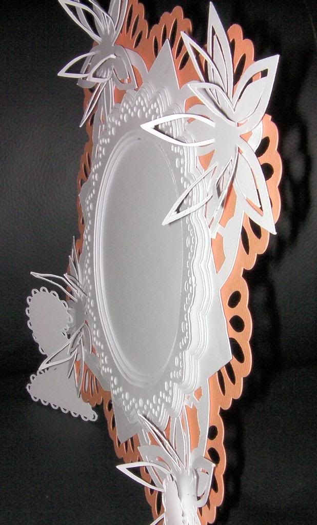
This is a versatile Stand Card or Photo Frame


Excuse the bright colours used, I did it for the purpose of showing the layers :)
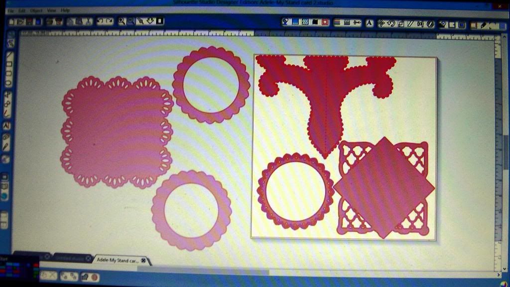
Here is what the file contains


I left my sample blank but you could add a photo or a sentiment or whatever, the stand is sturdy enough to take embellishment overload's hahaha.


I added some flowers to the 4 edges, though I didn't add them to my file share.

If you would like the FREE Studio file then you can get it HERE
Please leave a comment on my blog if you download, it will only take a second, that's all I ask in return :)

That's it for another month at Pam's, The BugBytes
Thanks for stopping by 
Until next month

Happy Crafting :)

Hugs

Adele

June 7, 2013

To Dad

Hello
This is Pam  from TheBugBytes and Papillon Digital Designs today on She's a SassyLady
Thanks Sheila for having me as one of your DT
Today I want to share a card I made for Father's day.
CAS style is the most difficult style for me but I tried to attempt that .


The embossing folder is spellbinder industrial
The auto stamp is Tim Holtz and the DAD are from recollections set got from Micheals
I took a silver pearlescent CS embossed and distressed it with sand paper to make the embossing pop.
A funny thing was usually when I stamp I always get some smudge here or there. And this time I wanted the ink smudges but nope it came clean as whistle and I had to add the smudges later :)
After inking with memento I embossed both the word and image with clear embossing powder.
I added some buttons and (irock) glam rocks.
Well that's my card for today.
Do share your projects with us.
Happy Crafting
Pam
post signature

To dad

Hello
This is Pam  from TheBugBytes and Papillon Digital Designs today on She's a SassyLady
Thanks Sheila for having me as one of your DT
Today I want to share a card I made for Father's day.
CAS style is the most difficult style for me but I tried to attempt that .


The embossing folder is spellbinder industrial
The auto stamp is Tim Holtz and the DAD are from recollections set got from Micheals
I took a silver pearlescent CS embossed and distressed it with sand paper to make the embossing pop.
A funny thing was usually when I stamp I always get some smudge here or there. And this time I wanted the ink smudges but nope it came clean as whistle and I had to add the smudges later :)
After inking with memento I embossed both the word and image with clear embossing powder.
I added some buttons and (irock) glam rocks.
Well that's my card for today.
Do share your projects with us.
Happy Crafting
Pam
post signature

June 5, 2013

Sharing something a little different - for me :-)

Hi everypeeps.  Its Karon here, from Karon's Krafty Korner and time to share a little bit of craftiness with you all.  Thanks Pam, for letting me come visit.

So, todays bit of stuff is a bit of messy time in the craft room and here is what I ended up with.


I decided to try something a little different.  This is a 6" by 8" piece of artist board.  Firstly, I gave it two coats of Gesso.  After drying the Gesso with my heat gun, I then used some Tim Holtz Distress Stain in the following colours; clockwise, Victorian Velvet, Tumbled Glass, Bundled Sage and Mustard Seed.  Next time I think, I will use a little more ink.


Next up, I tore up some text paper and some handmade papers and just placed them randomly over the board.  Then stuck them down with Modge Podge.  Now I only had Satin Modge Podge, but think I will get some Matte for next time or some Glue n Seal.  Anyways, we use what we have at the time, don't we?


Now, I didn't really know where it was going, other than I wanted to include the words "Spread your wings and fly".  I typed up the words on my computer and just printed them off, then cut them out and stained them with Tim Holtz Tea Dye distress ink.  I also added some twine to make the swirls and outlined the swirls with my Spectrum Noir marker BT5.  Also added some swirls with just the marker too.  I then gave the whole thing a couple of coats of Modge Podge.


Finally, I used my Silhouette Cameo and cut out some butterflies in various sizes to add to the final piece.  The butterflies are from Birds Cards and I only secured them at their bodies.  I added some little Recollection gems, that have been coloured with the Spectrum Noir marker. 


A close up of the butterfly.


Here is another view to the side to show those butterflies and bling.  I think I should have chosen a different colour for the butterflies, instead of the text paper.


So there you go, a little bit of mess to share :-)

Thanks for stopping by today.

Happy crafting.