f The Bugbytes: August 2010

Welcome - Copyright & Disclaimer

Welcome to The Bug Bytes a site/blog mainly for Papercrafting and some photography and other stuff thrown in here & there. Add in some die cutting machine, scrapbooking tools, cameras, scissors , glue and...... My name is Pam. If you have been redirected from Papillon Digital Design you have come to the right place.Hope you get inspired by the projects, videos and files. Would love it if you could leave comments and become a follower. (Word verification is turned ON to avoid spam. Sorry for that inconvenience.) Would love it if you would also share your project here . If you find a linky under the post do share your project by posting link there or if you do not find a linky post your link in the comments.Thank you for visiting. The website Papillon digital designs has changed to Papillon Digital Design so if the link gives and error or takes you to page with chinese characters then please drop the 's' in the link at the end of papillondigitaldesigns and try . That is change papillondigitaldesigns to papillondigitaldesign and try the link.

August 31, 2010

Life is a Beach....Seriously?!?!??!?


Hi Everyone!! Myamagoo here after a very long hiatus.....how have you all been?!?!?
 
I'm so glad Pam let me come back after being away for so long.
 
My goodness!! After seeing all the fabulous work from all of our designers I'm not sure I'm even needed anymore (this is meant as a compliment-the projects have just been simply outstanding!!).

My Task if I chose to accept it - is LIAB aka: Life is a Beach. I recall all the hoopla over this stinkin' cart and missing images...yada yada....I bought the cart....AND NEVER EVER USED IT! Gasp! This is the very first time I've made something with this cart....so I'm super happy today about that!


You all know I'm mainly card based...rarely try anything outside of the box...so....ANOTHER card from moi!      (I saw that yawn! hey!)


p.s. my camera battery died, had to use hubby's camera....I hate this little point and shoot thing....sorry the pics aren't as clear and sharp as the could be :(


I used 3 beautiful flowers from this cart....I circled in yellow the layers I used as well.


For the layers (the inside parts of the flower) I used Hide Contour function on Gypsy so I could cut out the insides using different patterned paper and placed it in different areas on my Gypsy Mat.


This is a Photo of the base of the card cut out on my mat...I GROUPED the 3 flowers together...and then added a rectangle - grouped it to the flower group. Then I pushed my weld button and VOILA!


Then I got out my MS score board and GENTLY scored the small areas that attach to the base so they fold easily.


Once I had all my flowers cut out, I tried Dry Fitting them to see how I wanted it to look. I ended up liking having the center flower be the focal point. Then as you can see I picked out some matching glitter - BRING ON THE BLING!!


The all time easiest and BEST way to put glitter on your cuts is to use a xyron machine.  I have the little X one and this larger guy.  I forgot I had the smaller one and remembered only after I had started running my cuts through! argh :)  Once you have run it through, rub your fingers over it to adhere the glue a little bit more.  Then peel off the back and you are left with a very sticky cut.  Grab your Glitter and Pour!


After I pour the glitter all over, I get a clean piece of paper and gently push down on top of my cut while all the glitter is still on. This pushes the glitter onto the paper without getting it all over your fingers. Then you can just bang your shape on the table and it's just so pretty!!!


The rest of the glitter cuts (the flower stems) all finished.


Don't forget to ink the edges of the rest of your flowers :)


Seeing as I wanted the center flower to be the focal point, I thought I should use pop dots and get some dimension going on.


Random photo of my newest and most favorite craft tool!! Cuts like butter and straight as an arrow EVERY TIME!!! I'm in Love! :) :)


And Now for the card all finished ~ I really hope you like it!


forgot to show you all what it looks like open....and I haven't the faintest idea of what I should put on the inside! :)


So great to be back here at Tuesday Treats!!!
See you all Next Month!!

~MAGOO~

oh! I used American Crafts Paper (Let's Play)...it cuts so amazing! 
File will be available for download on my blog when I get home from work today....my G is officially out of juice and happily charging away right now :)

August 30, 2010

LOL another glitch - CDS to gypsy? or not?

well I did the update (again found out accidently about the update when I just went to transfer files)
Since I have been working on computer  for days now and not touched the G I decided to my file in CDS and convert to gypsy. When I do this - I generally do some template work and fine tuning in gypsy. For eg if I want a border - I will do only 2 sides and then get to the G and do other two sides by grouping and copying and pasting. makes life easier for me - each to it's own I guess. Now I had sized  a rectangle from George and Basic shape to a  value. Then when I tried to unlink the chain and change it - nope it would not let me change the width individually  of the height. So  those who have CDS try doing this and let me know if this is just in this update or the previous too.  Let me test it further to see if the problem is just with George and Basic or other cartridges too. I will also try reset. Nope haven't done it yet as I want to analyse first before changing any factor

Updated: Tested and Strange - it is just this file which had problem. Maybe has to do with the half grouping thingy in CDS where we can group and move together but cannot copy paste. When I just pressed ungroup even though G does not show it grouped it changed
I will chalk it up as an anamoly!!

Gypsy update 0191/0202 - another content only update

Still no Celebrate with Flourish. But for the life of me cannot figure out what the new cartridges are. It says 0202 but as far as I know the christmas cartridges and thanksgiving and creative memories were in the last update itself 0201
I have been so out of touch  with the G and I guess will be until September end.
But back to back Thursday and Friday I am at TuesdayTreats followed by Sassy's (and thats how I picked up the G and found out about the update I guess).
So here they are
1) ?
Ha ha.
This time you gals and guys let me know what is the catridge
updated


There is no new cartridge . All were there in the previous update. So what did this update do?
Rename the cartridges (internally) to differentiate imagine and regular?
well you can all guess with me. Post in comments like a game and it will be fun to fun to find out if our guesses are correct

August 24, 2010

Fun and Easy Cupcake Box!

Hey everyone, my name is Kimberly and I am so excited to share this project with you!  Be sure to stop by My Craft Spot for more fun projects and vidoes!  I don't have the 'Life's a Beach' cartridge, so I decided to use George and my Gypsy.

This box was soooo fast and easy to make! You can download the free gypsy file on my blog! Just click on the 'cut files' tab and download the file (3" Box).


 Be sure to watch the video to see how I put it all together!


Have a great day!

August 19, 2010

How to use the Digital Kit

People have asked me if I am going to make videos on using the kit. I will not be doing that as there are tons of videos already there. Click on JS button on the right sidebar and it will take you to the website where you can take the up & coming class by JessicaSpraue to learn to use kits using adobe elements or photoshop.
But you can also just print out the elements and use it as Hybrid :) . Pages can be dragged and dropped in word and sized to 8 x 8. Turn off the page margin options by going to page layout as they are usually 1 inch and you do not want that to print on 8.5 x 11 paper if you want a 8 x 8 page. You also have to resize other elements till they fit. Best way is of course using a photo editor like Gimp which is free or  adobe photoshop elements or photoshop

Life is a Beach Inspired Project

Hi Everyone!  It’s Wini from LooneyBugDesigns here with your inspiration for the day.
Orchid 7 
As much as I love this months cartridge Life is a Beach (LIAB), for some reason I do not own it yet.  Even though it is on my list of cartridges to get, there are others that I want more so I decided not to go out and get it right now.  Instead I turned on my Gypsy and started looking over the images on LIAB for inspiration.  I loved the Orchid Image and decided I would use that as my inspiration.
Next I needed to pick an Orchid type flower from a cartridge that I do have.  I decided to use 50 States since it has so many different flowers and found one that I liked.  I placed 4 flowers and the matching layer on a mat on my Gypsy and used my favorite feature Hide Contour to erase all the parts I didn’t want.  I LOVE THIS!  Here is a picture of my Gypsy Mat all ready to cut.
Orichid 1
Now why did I use 4 flowers?  Because that is how many fit on the paper that I was planning on using.  No other reason then that.  I cut them out of white paper so that I could color them with my Copics any color I wanted.  I love to start with a blank canvas.
Orchid 2
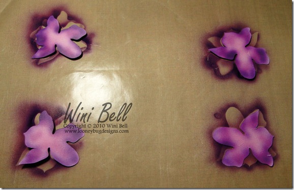
I airbrushed the Leaf on all 4 of the bottom layers (I only ended up using 2 of the bottom layers but I colored all I had in case I made a mistake – and besides it is so fun to airbrush! I ended up using 3 colors of green and a hint of pink on the leaves.
Orchid 3
Next it was time to color the flower layers.  I airbrushed the tops and backs of all the flower layers so that I could curl them up and add lots of dimension to the flower.  The flowers have 3 colors of violet, some pink and on the top sides (sorry didn’t get a picture of that) some yellow in the center.  I shaded them lightest in the middle and darkest along the outside edges – because that is the way I thought they looked good.
Orchid 4
Next I layered my flower, curling up the edges as I went and added some yellow Flower Soft to the middle because I felt it was too flat.
Orchid 6
My last step before putting my airbrush system away was to color some cream ric-rac to match the flower.  The dimension on this card is perfect and reminds almost more of a Lilly Pad flower then an Orchid but I still like it anyway.
Orchid 8
Remember just because you don’t have a cartridge that someone used on a project doesn’t mean you can’t make something.  I love to improvise and add my own twist to things.  So break out your cartridges and imagine what you can make with them!
Thanks for visiting today and come back Tuesday for another great LIAB Project. 
Wini aka LooneyBug aka PoohBearBaby from the Cricut  & Circle MB’s

August 18, 2010

My new blog

I have a new blog for Digital kits -
Papillon Digital Designs

Hop over there and I have a kit I made in there. Feel free to download the kit if you like it. Please abide by the terms and conditions found in it. Email me with your creations :). I would love to see what you come up with.

Welcome

Welcome to my Digital Design Blog. As my sister blog - TheBugBytes is solely for Cricut Gypsy this blog is for Digital Scrapbooking Kits.
Here is my very first kit called RainDance. To download this kit click on this link -
Hope you like this kit.


August 17, 2010

Lifes a Beach Bon Voyage card

Hi, I'm Flo and I am a guest designer this month for Tuesday Treats. I am Flohill on the cricut message board and my blog is http://flos-a-scrapin.blogspot.com/ This months cartridge for Tuesday Treats is Life is a Beach and I designed a card from this cartridge.
LIAB
The first Pic shows the gypsy and the icons from LIAB that I put on the screen.
LIAB
The 2nd pic shows where I placed the papers to cut the icons. I have always used CDS or a gypsy. I have used the whale, the dolphin, the gekko, the starfish and the chairs at 2 inches. The waves at the bottom are at 1 inch and the 2nd layer is slightly smaller to fit the mat. The wording is 1 inch. I used textured cardstock from http://www.grant.com.au/ and A5 designer Paper 'Azalea' from Rosie's Studio. Both of these I cut on medium speed pressure 4 cutting blade 5 and double cut. The tops of the starfish did not cut well so I discarded those. Once cut I put together the layers of the dolphins, the chairs and the whales but the gekkos I left without the layer as I had cut them in coloured paper.
LIAB
I used a premade card from a pack and used SU ink pads to sponge the background inside the card. I used 3 shades of blue- Brocade Blue, Brilliant Blue and almost amethyst and for the sand used creamy caramel, barely banana, and summer sun. To get the sun I sponged around a circle and left the centre white. You can see in this 3rd pic. I have added the whale and also added the first bank of waves.
LIAB
I have added 3 sets of waves and have made these stand up by making them pop up like a pop up card with the attachment to either the waves behind or to the back of the card. I have added the whales to the back of the card and the dolphins to the waves so when you open up the card the waves and the dolphins pop out from the back of the card. You will see I got a bit messy and ended up with blue ink on my sand so I used the starfish to cover this and then added the gekkos. The life's a beach wording came from the cart and has been cut at 1 inch and outlined in gold pen.
LIAB
LIAB
The wording on the bottom of the card reads Bon Voyage again from the LIAb cartridge.
LIAB
LIAB
LIAB
This is the front of the card and again the wording is from the font on LIAB and the whale and the beach chairs.
Below I describe how I have made the waves pop up.
I made the waves from the card pop up so I could put the dolphins in the waves. I used the system I describe here but made the boxes very small so they would be hidden behind the waves.
How to do the popup parts. I have made this box large so if you are unsure how it works you can see it but when you are using these to do popup cards make the box so the object you are popping up hides the box.
strip of paper to make box
Take a strip of paper and make a square. box
Adhere one side of the square to the base of the card directly in front of the fold of the card. box adhered to base of card
Adhere the back of the square to the top of the card so now when you open the card there is a square box in the fold of the card. box adhered to back of card
Adhere the object that you want to popup to the front of the square. Look at the pictures and you will see the card now can close and the object lies flat and pops up when the card is opened. place object on front of box stand back of card up object stands up object bends forward and down when card folds
The waves I made were quite small and the boxes behind are about 1/4 inch but they have worked well and the waves and dolphins pop up. I hope you have enjoyed looking at how I di this card as much as I enjoyed making it. Check out my blog to see other things I have done.

August 16, 2010

Special Event Book

Hello, this is Sheila from ShesASassyLady and I am so excited to share with you this wonderful Special Event Book. Pam at TheBugBytes has been focusing all month on Just Because Cards and although I love that cart I had just made a bunch of cards and wanted to share something else with you! So today I will take you from thought process to completed project. This is a much longer post than I normally do so please grab a cup of coffee or tea or maybe a diet coke or pepsi and sit down and spend a few minutes with me...


I am so excited with this big-little project!!! I say big as it is my first little book of sorts. After deciding to make this project and the size I was going to do I had to come up with a cover that I felt was sturdy enough to take a little abuse and I did not have any thick chip board. So I collected the pieces of cardboard around the office and started cutting and stacking until I felt I had the right thickness.
Before the final cut on my cardboard or should I say future cover I took my papers that I used for the thought process and placed and cut the cardboard exactly the size I wanted.
I ended up using 2 with an old file folder sandwiched in between and I am thrilled with the results. I used an ATG to adhere the three pieces together.
I then trimmed my DCWV Maraposa card stock and covered the cardboard making sure edges were glue with Zip Dry so they wouldn't pull apart.
I marked where the bottom was to I could make sure I had a front and back cover and as I was using the same paper on both it was easier to match and make sure the paper was going in the right direction.
I inked the edges of the dark brown as I didn't want any white edges, just a nice finished look to it.
Here is my front cover and all the different color papers I chose to go inside. The paper is from K and Company the Life's Journey stack. The nice thing is every page had a different coordinated color on the reverse side. Aren't the papers just beautiful. Make sure you tap the photo to enlarge so you can see what I mean. Next I trimmed off 1 inch of the paper so that I would have an 11x12 inch paper.
Then I used my score pal with a score mark at the center or 6 inches on 1 side and then 3 1/2 inches in the other direction.
Then all I had to do was draw up the bottom to form the little pocket, use the bone folder for a sharp edge.
Then fold in half again, and once again take the bone folder and get clean sharp edge.
I continued with this until I had 6 pages or 12 pockets; 1 for each month of the year.
Well the book part is almost ready.... All I have to do is bind it and decorate it. Look how nicely these colors coordinate?


Next I need to start making my tags. I decided to do a tag I could fit right in the pocket rather than on it as I didn't want to make another book it the space filled up, but I could easily replace a tag or write on both sides if I needed to. It was actually easier to design this on my Gypsy Woman and write with the Cri-Kit Pens than to type up and then print with card stock on my computer. I use my pens whenever I can.

This was the second video I did with the pens, you know I made a blunder with the first and had to redo it!

I took the extra time to ink the little calendar pages and I am so glad I did, they look so much nicer, don't you think?
I glued all the months on the tags and there is plenty of room for birthday and even anniversary's. The neat thing is that if one side gets full I just cut another and adhere it to the back! so easy!
Thought I would show you a couple of the backs. They come from the same K and Company Life's Journey stack and are so beautiful!
Well here are my pages before binding them. I don't mind telling you I am a nervous wreck as I have never used the Zutter Bind It All before and I don't want to goof this up!!!
Let me tell you even though I watched the video several times and read the little book I did plenty of praying when I did this, and God is good - it cut beautifully. I had a little problem with my page order but was able to get that figure out. If you need assistance in this click HERE for the Bind It All video.
Now that it is all together I will use my little cuts from my wonderful Gypsy and Cricut... my Dynamic Duo to embellish along with other goodies. I am going to keep it lite as I don't want this book to get too bulky.


Now I sure hope you like my little special events book. It sure has changed from thought process to finished product but I love it. I can keep all my dates in one place and plan for the entire month what cards need to be ready and when. After making I realized there isn't a book big enough to hold a years worth of cards for birthdays and anniversaries but this is the perfect answer for what I need. It is pretty and so easy to refer to and update when ever needed.
I sure hope you enjoyed today's project and I hope I didn't bore you with my first videos for a project. This book was so much fun to make and it really challenged me, yet it is something each and everyone can do too.
MyFreeCopyright.com Registered & Protected
Thank you for your sweet words of encouragement. Your comments continue to inspire me and lift my spirits.
signature